Turn-in Blog Address

Final Projects

Major Projects that need to be finished . . .

  1. Liquify Tool
  2. Healing Brush
  3. Selection Tool / Cut out
  4. Healing Brush 2 -Dog
  5. Zebra-Rhino
  6. Vocab Review #1
  7. Vocab Review #2
  8. Gray Scale / Value Scale
  9. Color Blend
  10. Painted Sphere
  11. Illustrator: Robot
  12. Illustrator: Octopus
  13. PS Technique 1- 8
  14. Levitation Project
    1. Initial Thoughts
    2. Research
    3. Plan
      1. List of Assets
    4. Final Images

Create a Super Happy Octopus Character

by Ryan Putnam   Original Link

You are to create a Super Happy Octopus Character with your own twist.  Meaning your own version of it, maybe different colors, slightly different shape, vampire?, angry, what ever combination. It needs to be very different.   I am looking for QUALITY!!!!  I would suggest, following along first and then changing the image after the fact. 

In Illustrator it's really easy to create fun characters with some simple shapes and the Pathfinder panel. In the following tutorial I will explain how to create a Happy Octopus Character. You can use these techniques and elements to create whatever character you want!


CLICK HERE FOR TUTORIAL . . .

Create a Cool Vector Robot Character in Illustrator

What is Illustrator?


Let’s learn some basics . . .

Img

Original Link by Chris Spooner

Looking to learn the basics of Adobe Illustrator? In this tutorial we'll use various tools and techniques to create a simple vector robot character. With this robot being made of lots of basic shapes it makes for a great tutorial for beginners to get to grips with the Illustrator application.

Here's the simple vector cartoon robot character we'll be making in this tutorial. It's essentially made up of lots of basic shapes such as rectangles and circles, but we'll bring it to life with varied stroke weights, gradient fills and subtle highlights.

Here's the simple vector cartoon robot character we'll be making in this tutorial. It's essentially made up of lots of basic shapes such as rectangles and circles, but we'll bring it to life with varied stroke weights, gradient fills and subtle highlights.

Click Here for Tutorial . . .

Painted Sphere

LEARNING TARGETS:
»  I can paint a realistic sphere in Adobe Photoshop.
»  I can blend color SMOOTHLY to show a spheres volume in Adobe Photoshop.
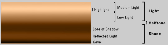
» I can identify the important components of light & shadow : Umbra, Penumbra, Specular Highlight, Reflected Light, Core Shadow, Ambient Shadow, and Mid-Tone Value.
»  I can identify the direction of the light source and accurately paint the shadow in Adobe Photoshop.

EXPECTATIONS:
»  You are to repaint this reference image using Photoshop in a 5 X 7 document (@ 300 DPI) including the background, shadows, & specular highlight.
» All layers must be labels; post a screen shot of layers in blog.
 *Document in blog.

NEW VOCAB

Shadow Diagram3

imageimage

Umbra – (Latin for "shadow") The area completely obscured by object or the “Hard” shadows
Penumbra – The area partially obscured by object or the “Soft” shadows
Core Shadow – The shadow edge
Specular Highlight - This is a reflection from a light source and is the bright spot of light that appears on the surface of a 3d object. The smaller the highlight the shinier the surface, the larger the highlight the more the surface defuses the light.
Reflected Light – Is a faint light reflected or bounced back on the object from the surfaces surrounding it.

Mid-Tone – The tonal value mid-way between the highlight and shadow. Sometimes referred to as halftone.
Value – The gradation of tone from light to dark or of color luminosity
General Notes:

Paint the Sphere in these stages:

  • Copy, paste, and scale the reference image in the upper left hand corner. *Hold shift maintains an equidistant aspect ratio. Scale it and place it appropriately.  Name the layer Reference
  • Using the Elliptical Marque Tool, draw a circle while holding down the {SHIFT} key. *Hold shift maintains an equidistant aspect ratio. Scale it and place it appropriately.
  • Create and label 6 new layers and use them accordingly.
    • Reference
    • Specular Highlight
    • Ground Reflection
    • Sphere
    • Key Shadow
    • Ambient Shadow
    • Background
  • Paint the base color/value giving the sphere volume in the Sphere layer. *Use a layer mask.
    • Create a layer mask using the elliptical tool
    • Fill in mid-tone color first
    • Using the reference image, give
    • Paint the reflected color in the Color layer.
  • With a large brush, paint the Background layer use the image as a reference.   It has a slightly light to dark fade, just slightly.
  • Paint the Specular Highlight in the Specular Highlight layer. 
  • Paint the ground reflection in the Ground Reflection layer.  *Use a layer mask.
  • Paint the key shadow in the Key Shadow layer.
  • Paint the ambient shadow in the Ambient Shadow layer. 


Image Size:  Landscape 5 X 7 at 300dpi
spher

Painted Sphere

LEARNING TARGETS:
»  I can paint a realistic sphere in Adobe Photoshop.
»  I can blend color SMOOTHLY to show a spheres volume in Adobe Photoshop.
» I can identify the important components of light & shadow : Umbra, Penumbra, Specular Highlight, Reflected Light, Core Shadow, Ambient Shadow, and Mid-Tone Value.
»  I can identify the direction of the light source and accurately paint the shadow in Adobe Photoshop.

EXPECTATIONS:
»  You are to repaint this reference image using Photoshop in a 5 X 7 document (@ 300 DPI) including the background, shadows, & specular highlight.
» All layers must be labels; post a screen shot of layers in blog.
 *Document in blog.

NEW VOCAB

Shadow Diagram3

imageimage

Umbra – (Latin for "shadow") The area completely obscured by object or the “Hard” shadows
Penumbra – The area partially obscured by object or the “Soft” shadows
Core Shadow -

Specular Highlight - This is a reflection from a light source and is the bright spot of light that appears on the surface of a 3d object. The smaller the highlight the shinier the surface, the larger the highlight the more the surface defuses the light.
Reflected Light – Is a faint light reflected or bounced back on the object from the surfaces surrounding it.

Mid-Tone – The tonal value mid-way between the highlight and shadow. Sometimes referred to as halftone.
Value – The gradation of tone from light to dark or of color luminosity
General Notes:

Paint the Sphere in these stages:

  • Copy, paste, and scale the reference image in the upper left hand corner. *Hold shift maintains an equidistant aspect ratio. Scale it and place it appropriately.
  • Using the Elliptical Marque Tool, draw a circle while holding down the {SHIFT} key. *Hold shift maintains an equidistant aspect ratio. Scale it and place it appropriately.
  • Create and label 6 new layers and use them accordingly.
    • Reference
    • Specular Highlight
    • Ground Reflection
    • Color
    • Key Shadow
    • Ambient Shadow
  • Paint the base color/value giving the sphere volume in the Color layer. *Use a layer mask.
    • Fill in mid-tone color first
    • Paint the reflected color in the Color layer.
  • Paint the Specular Highlight in the Specular Highlight layer. 
  • Paint the ground reflection in the Ground Reflection layer.  *Use a layer mask.
  • Paint the key shadow in the Key Shadow layer.
  • Paint the ambient shadow in the Ambient Shadow layer. 


Image Size:  Landscape 5 X 7 at 300dpi
spher

Digital Painting: Color Blend

LEARNING TARGETS:
»  I can use rulers and guides in Adobe Photoshop.
»  I can blend one color to another SMOOTHLY using a brush in Adobe Photoshop. 
»  I understand the responsibilities and ethics associated with publishing to the internet

EXPECTATIONS:
»  CREATE:  Blend two primary colors to make a secondary color - using Photoshop in a 5 X 7 inch document at 300 DPI. 
»  CREATE:  Blend one primary color and one secondary color to make a secondary color - using Photoshop in a 5 X 7 inch document at 300 DPI.
»  REFLECT:  Document the whole process in your blog and reflect what you learned.

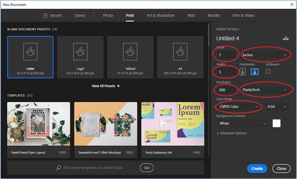
Create a new document with a resolution of 300 DPI, with a size of 5 X 7 inches. 
Using the ruler, setup six, 1 3/4" X 2" rectangles, 1/2” from the edge. Three on the top and three on the bottom. Then delete the background layer.
Show Rulers by pressing {Ctrl} +{r}
Color_Blending

Create a new layer, label it Secondary Blend, and divide the three squares into two and fill each with a primary color.  
Create a layer mask for all the secondary Blend layer.  Using the Rectangular Marquee Tool, select the all three of the 2” blocks then add a layer mask.
Color_Blending_Primary
In the Secondary Blend layer, not the layer mask, blend each secondary color smoothly together.  Use a large brush with a soft edge and set the Flow to something low, like 1-4%.  Use the eye dropper to pick the value that you want to work with and blend.  Does that make sense?
What Happens When You Mix Primary Colors?
When you mix two Primary Colors together, you create a secondary color. Mixing blue and red creates purple; red and yellow make orange; yellow and blue make green. The exact hue of the secondary color you've mixed depends on which red, blue, or yellow you use and the proportions in which you mix them.
Blend the two colors, and it should look something like this.
 Color_Blending_Primary2

Create another new layer, label it Tertiary Blend, and divide the three squares into two and fill the first with a primary color and the second with a secondary color.
Create a layer mask for all the Tertiary Blend layer.  Using the Rectangular Marquee Tool, select the all three of the 2” blocks then add a layer mask
A tertiary color create by mixing either one primary color with one secondary color, or by mixing two secondary colors.
 Color_Blending_Primary3
In the Tertiary Blend layer, not the layer mask, blend each secondary color smoothly together.  Use a large brush with a soft edge and set the Flow to something low, like 1-4%.  Use the eye dropper to pick the value that you want to work with and blend. 
Blend the two colors, and this is what your finished project should look like.
Color_Blending_Primary4
Hide the background and then post in your blog.

Digital Painting: Grey Scale / Value Scale

LEARNING TARGETS:
»  I can use rulers and guides in Adobe Photoshop.
»  I can blend black to white SMOOTHLY using a brush in Adobe Photoshop. 
»  I understand the responsibilities and ethics associated with publishing to the internet

EXPECTATIONS:
»  CREATE:  Paint a Grey Value Scale using Photoshop in a 5 X 7 inch document at 300 DPI. 
»  REFLECT:  Document the whole process in your blog and reflect what you learned.
Create a new document with a resolution of 300 DPI, with a size of 5 X 7 inches. 
size2
Using the ruler, setup 6, 1 inch squares, 1/2 inch from the edge.
Show Rulers by pressing {Ctrl} +{r}
Rulers
Create a new layer, label it Reference Layer, and fill in each square with the appropriate values.  Use the Rectangular Marque Tool {m} on the keyboard to active to select the area, assuming Snap is active, it should line up perfectly.
tools
GreyScaleBlend4   
It should look something like this.
GreyScaleBlend3
In a new layer, label it Blend Layer, create a rectangular value scale 1/2 inch below the top one.
GreyScaleBlend5
Hide the background.
Swatches
Layers2
Using the Text Tool, add the word Brightness and its corresponding percentage.
Change the size and font as desired.
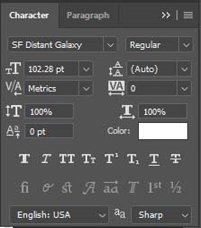
To open up the character attribute menu, Windows > Character Make sure it is checked.
Char
This window should appear.
Char2
It should look something like this . . .
Screen
Create a layer mask for all the value blocks in the Blend Layer.  Using the Rectangular Marquee Tool, select the all the value blocks in the Blend Layer.  Once selected, add a layer mask.

Swatches2
GreyScaleBlend2
It should look like the Blend Layer Here.
In the Blend Layer, blend the black smoothly to white.  Use a large brush with a soft edge and set the Flow to something low, like 1-4%.  Use the eye dropper to pick the value that you want to work with and blend.  Does that make sense? It should look like the sample below.
This is what your finished project should look like.
GreyScaleBlendS

Vocab Review #3

In your blog, define these enrichment vocabulary terms in your own words.  That means find the definition and re-write it on your own words – NO COPY & PASTE.  ALSO, FIND IMAGES THAT REPRESENT EACH VOCULARY WORD  AND  ADD IT TO YOUR DEFINITION FOR EACH.

  • Rhythm
  • Directional Movement
  • Proportion / Scale
  • Balance
  • Unity
  • Harmony
  • Contrast
  • Emphasis (Focal Point / Center of interest)

CG Vocab Review #2

In your blog, define these enrichment vocabulary terms in your own words.  That means find the definition and re-write it on your own words – NO COPPY & PASTE.  ALSO, FIND IMAGES THAT REPRESENT EACH VOCULARY WORD  AND  ADD IT TO YOUR DEFINITION FOR EACH.

Elements of Art

  • Line
  • Shape
  • Form / Volume
  • Color
  • Value/Tone
  • Texture
  • Space
  • Perspective

CG Sub Day: 10/7 –10/9

As you can see I am not here today, my father had a heart attack and I went back to New York to be with him.  I will be gone all week, so I have written some notes for what needs to be done while I am gone. 

The following past projects need to be finished:

Liquify Tool
Healing Brush- Practice
Healing Brush - Final
Selection Tool
Zebra-Rhino
PS Techniques
Composition

ALSO, you are to complete each vocabulary enrichment 1-3, one for each class period.

http://digital-evolutions.blogspot.com/search/label/CG-Vocab


WRITE IN YOUR BLOG!!!

CG Vocab Review #1

In your blog, define these enrichment vocabulary terms in your own words.  That means find the definition and re-write it on your own words – NO COPPY & PASTE.  ALSO, FIND IMAGES THAT REPRESENT EACH VOCULARY WORD  AND  ADD IT TO YOUR DEFINITION FOR EACH.

  • Analogous Colors
  • Complementary Colors
  • Primary Colors
  • Secondary Colors
  • Tertiary Colors
  • Asymmetry
  • Symmetry

Cool Photoshop Background Tutorials

 
Windows Vista Aurora Effect
 

Windows 10 Wallpaper
w04[1]

Laser Particle Abstract Effect
laser-crystal-effect-flatten-2[1]


Simple Glowing Floral Pattern Creation
abstract-floral-flatten-500x500[1] 

Beautiful Hair-like Abstract Lines
abstract-lines-2-flatten[1]


Awesome Abstract Nebula Circle Shape
abstract-circle-flatten[1]

Beautiful Abstract Coloured Falling Lines
flowing-abstract-pattern-version-2-750x350[1] 

Final Fantasy VII Lifestream-Like Abstract Design
life-stream-flatten-2[1]

Freezing Cold Snow-themed Abstract
final_small[1]


Abstract colorful background with bokeh effect
 160[1]


Interplay of Abstract Light Streaks
20[1]

Vector Background with Colorful Bubbles
1[1]


Create Contemporary Abstract Background of Geometric Shapes
1[1]

 
36[1] 
Create-Special-Color-Effect[1] 

Simple Vibrant Light Effect
25[1]

Make a Realistic Star Field
12[2]

Space Lighting Effects
Space-Lighting-Effects-in-1[1]


 Chroma Wallpapers
How to create a energetic, vibrant, colorful wallpaper


Windows Vista Aurora Effect
How to create the Vista aurora effects in Photoshop.


Abstract Walkthrough


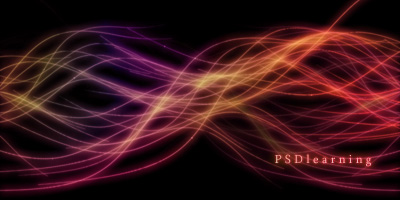
Luminescent Lines
This technique is fairly simple and is a great way to create an abstract wallpaper or looks good integrated into another image.


Photoshop Tutorials Thumbnails

Photoshop Tutorials Thumbnails


Photoshop Tutorials Thumbnails

Photoshop Tutorials Thumbnails